
Sphinx Design
Sphinx-Design is an extension that provides directives for reusable and screen-size responsive web components.
MCL Theme supports a limited subset of Sphinx Design, although we are considering adding full support in the future. So far, the supported components are: Grids, Badges and Cards.
Using Sphinx Design with MCL Theme
In order to use the Sphinx-Preview extension, you must first install it:
pip install sphinx_design
# or
uv add --group docs sphinx_design
Then, you should activate it:
extensions = [..., 'sphinx_design']
The extension comes without settings, but the components themselves are highly configurable.
More information is available on extension’s homepage.
Kitchen Sink
This is a list of all components that have styles provided in the theme.
To view syntax, use the View source button at the top of this page.
Badges
Inline badges can be used as a labelling component. Badges are available in each semantic color, with filled and outline variants:
plain badge
primary, primary-line
secondary, secondary-line
success, success-line
info, info-line
warning, warning-line
danger, danger-line
light, light-line
dark, dark-line
Cards
Cards contain content and actions about a single subject. A card is a flexible and extensible content container, it can be formatted with components including headers and footers, titles and images.
Simple cards
Cards can have title and body:
Card content
They can also, optionally, have a header, footer or both:
Header
Card content
Card grids
You can arrange cards in grids with grid-item-card:
Header
Card content
Header
Longer
Card content
Cards with images
Note
img-background option is not yet implemented in the
MCL Theme.
You can also add an image as the background of a card
or at the top/bottom of the card, with the
img-background, img-top, img-bottom options:
Card content
Card content
Card content
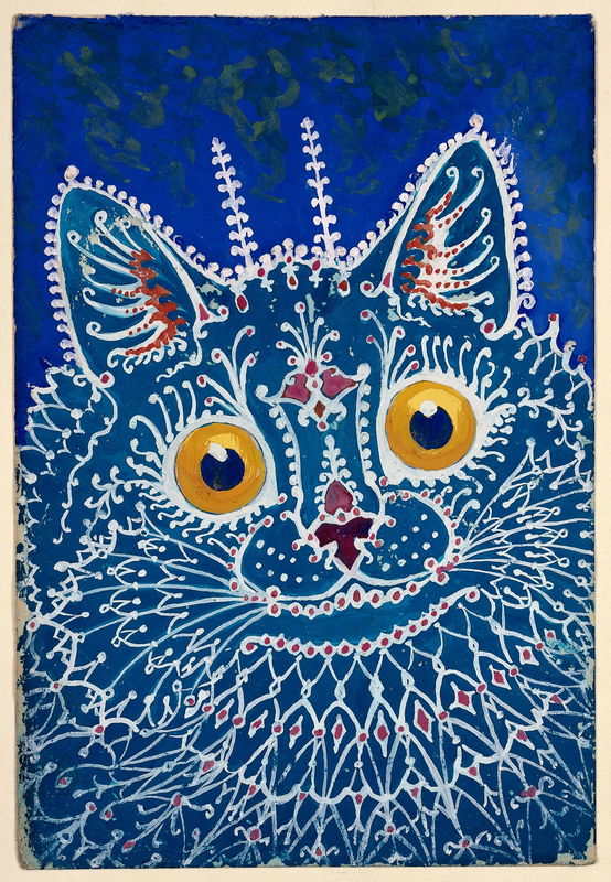
Cat
Cat
Cat
Clickable cards
Using the link and link-type options, you can turn
an entire card into a clickable link. Try hovering over
then clicking on the cards below:
The entire card can be clicked to navigate to https://hyte.com/.
The entire card can be clicked to navigate to https://hyte.com/.
Card menu pattern
Error
You can’t nest menu within cards, actually, since Sphinx-Design has a silly bug which prevents it from properly reading headers within nested cards. And since menu is made of cards that have headers, well, you can see for yourself, if you’re curious.
Cards with headers can be clickable too, we can use that
to implement the card menu pattern by combining
header-and-image-only clickable cards with Grids and the
utility class provided by this theme (mcl-x-sd-menu-grid):
Cats
Cats
Cats
Cats
Cats
Cats
Card carousels
The card-carousel directive can be used to create a single row of fixed width, scrollable cards. The argument should be a number between 1 and 12, to denote the number of cards to display.
When scrolling a carousel, the scroll will snap to the start of the nearest card:
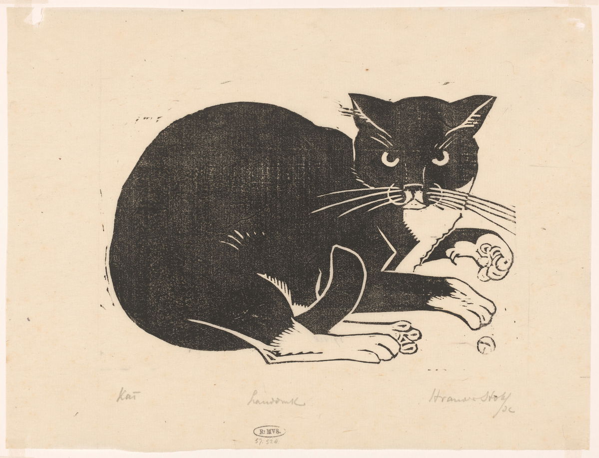
Gothic Cat
Gothic Cat
Gothic Cat
Gothic Cat
Gothic Cat
Gothic Cat